
PEDAL PUSHERS
ALL UX ROLES
2 MONTHS
FIGMA
ALL UX ROLES
2 MONTHS
FIGMA
INTRODUCTION
In this UX case study, I will be sharing my design process for creating a mobile flower ordering app aimed at busy working professionals. The app was designed to provide a convenient and hassle-free solution for customers to order flowers on the go, with a focus on ease of use.
Throughout the project, I conducted extensive research into the target audience and their needs, as well as analyzed the existing competition to identify opportunities for differentiation. I developed a range of design concepts and iteratively refined them through user testing and feedback.
The final design features a simple and intuitive user interface, with a personalized and seamless ordering process. Users can easily browse and select from a range of flowers, customize their order, and track the progress of their order in real-time.
On this page I will showcase the various design artifacts, including wireframes, user flows, and high-fidelity prototypes, as well as highlighting key design decisions and challenges faced throughout the project. Overall, this case study demonstrates the importance of user-centered design in creating a successful mobile app, and the value of a rigorous design process in ensuring a seamless and enjoyable user experience.
FIRST, SOME GOALS FOR MYSELF
This is my first UX case study, and although it isn't perfect, I have learned more from my failures than my triumphs. Before beginning this project, I set some goals for myself to stay grounded and focused. These goals also served as a marker and something to reflect on upon upon completion. The goals:
- Create a flower catalog that is easily accessible and approachable.
- Design an interface that is cohesive and makes sense to both veteran users and newcomers.
- Keep the product and user at the forefront of the design process.
- Create a straightforward purchasing process.
- Learn the fundamentals of excellent user experience and user interaction design.
IDEATION
PROBLEM STATEMENT
Busy professionals often struggle to find the time to order flowers for special occasions or to brighten up their home or office. Existing flower ordering apps may be difficult to navigate, time-consuming, or lack personalized features that cater to their specific needs. As a result, these professionals may feel overwhelmed or discouraged from using such apps and may resort to traditional brick-and-mortar florists instead.
The problem, therefore, is how might we design a mobile app that simplifies the process of ordering cut flowers for busy professionals by providing a seamless and personalized experience that caters to their needs and preferences, while also enabling quick ordering and reliable tracking.
RESEARCH:
- User Interviews
- User Personas
- Competive Audit
- Usabilty Study
TARGET AUDIENCE
The target audience is busy professionals seeking a personalized, hassle-free flower ordering experience. Tech-savvy and time-conscious, they value convenience, reliability, and seamless browsing, tracking, and customization. They appreciate personalized features and are willing to pay a premium for high-quality flowers and reliable services.
USER PERSONAS
Carol
The, “There’s never enough time in the day” user.
Carol is a working professional with a young family. Carol has a vision impariment but she enjoys having flowers in her home. When she does get flowers she is very specific about what type she gets and what they smell like.
“I like things the way I like them. My husband would call me fussy and my children would maybe call me bossy but I prefer to say I’m just particular and there is nothing wrong with that.”
Walter
The, “I want to get nice flowers but the process has to be easy” user.
Walter works for the local state park but isn’t stressed about the type of flowers he gets. He mainly picks them up beucase he knows his fiancé likes them.
”I love my soon to be wife, our puppy Rosco, and anything that gets me outside!”

COMPETITIVE AUDIT
After examining four companies, two of which were local cut flower/bouquet/plant distributors serving the suburbs of Chicago and Baltimore, an online large national bouquet distributor, and an online succulent/plant distributor, I found that the local floral distributors lacked the quality, accessibility, and scheduling ease that the national distributors provided. This created a gap in the market that could be filled by Pedal Pushers. To succeed, Pedal Pushers would need to create a seamless app design, offer users an accessible interface, and provide detailed scheduling and tracking options. By making these improvements, Pedal Pushers could position itself nicely in the market.
This is how I broke it all down:
Competitor Strengths:
- All seemed to be successful companies
- All had a functional online precence and process
- All advertised their product well
- All had a functional online precence and process
- All advertised their product well
Competitor Weaknesses:
- Some lacked accessibility
- Some of the processes were outdated and clunky
- Some lacked complete view of product and description
- Some of the processes were outdated and clunky
- Some lacked complete view of product and description
Opputunities:
- Imporve accessibilty, mobile design, and branding
- Improve product viewing and descriptions
- Improve the look and feel of interface to excite users
- Improve product viewing and descriptions
- Improve the look and feel of interface to excite users
IDEATION RPOCESS
I compiled my notes and continued with a "How Might We..." exercise, Crazy Eight, and completed some storyboarding. I used these tools and techniques to help me develop a solid plan for Pedal Pushers.
DESIGN
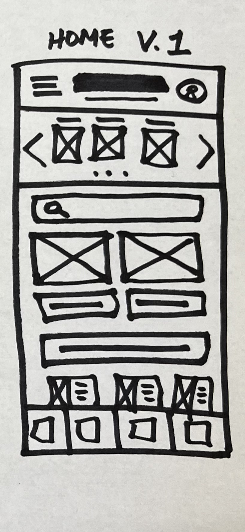
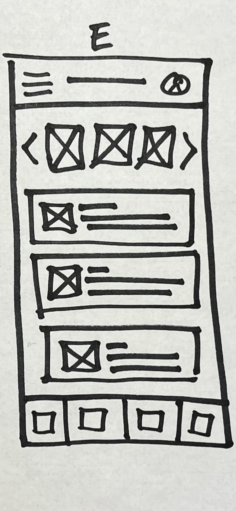
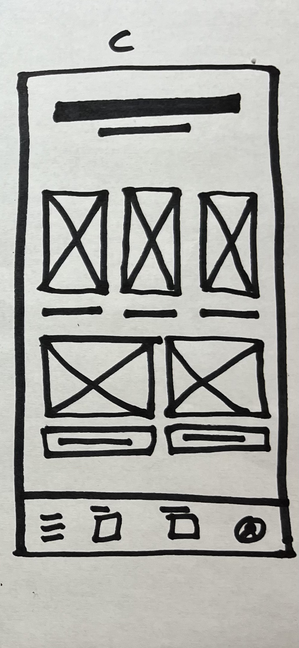
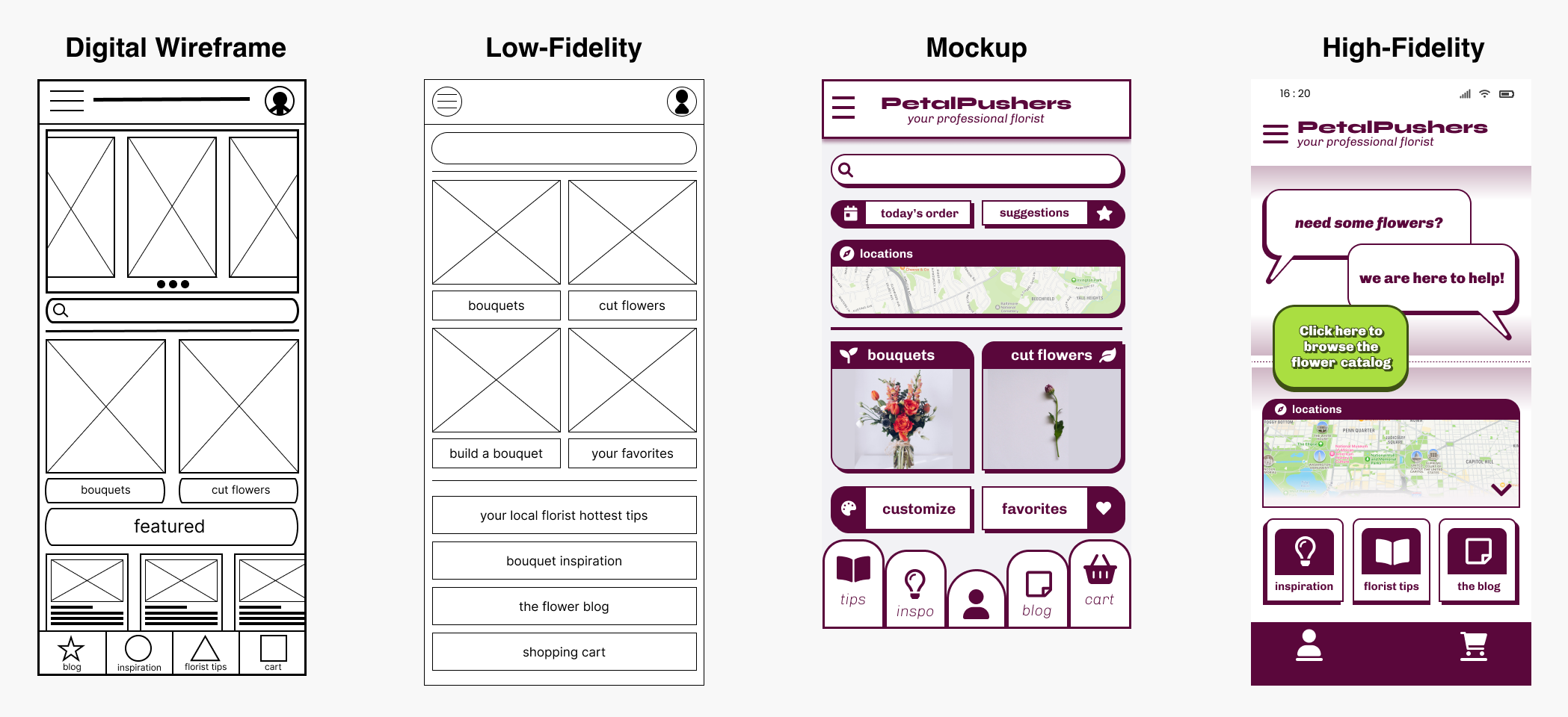
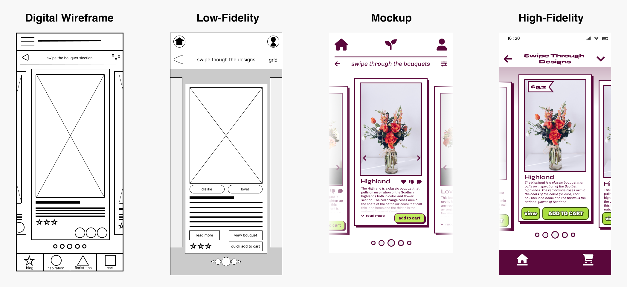
SKETCHING AND WIREFRAMING
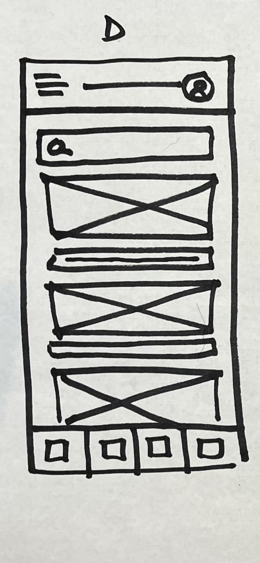
I started by sketching my ideas on paper and using a marker to make bold lines and choices. Below, you can find one of the many studies I completed for the home screen of Pedal Pushers. A-E are all individual designs, while HOME V.1 is a combination of elements from the different sketches to create a cohesive and polished design. Iterating on the designs was crucial during this stage for both my growth as well as for the product’s development.
You can shuffle these pages around ︎


VISUAL DESIGN
Before moving to Figma, I did a lot of work on paper. I completed numerous sketches and wireframes and utilized brainstorming exercises to improve my choices and allow myself not to judge my own work. This was a skill that I was able to develop through trial and error.
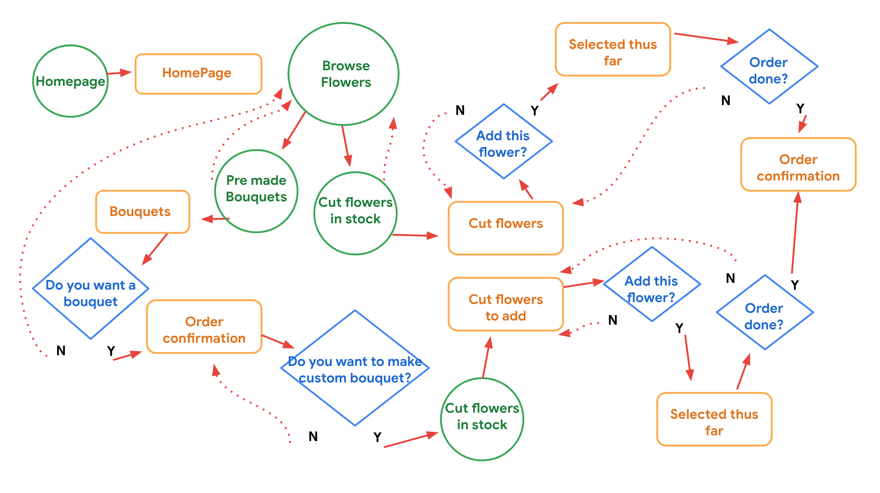
USER FLOW
The next step I took was to refer back to the personas I had created and put myself in the shoes of the user. I designed user flows that were seamless, made sense, and empowered my users. I wanted my users to have options and navigate with ease. I also made sure to reference my goals for the project at this point to ensure that I was taking active steps towards achieving them.
PROTOTYPE
LOW-FIDELITY
I had a solid understanding of the project and moved on to developing low-fidelity prototypes. I was excited because this meant I was approaching a point of critique -- my first usability study.
This prcesses of creating a low-fidelity prototype was not a straight line, I went through two iterations to finally land on what you see below.

THE USABILITY STUDY
Key performance indicators:
- Time on task
- Conversion rate
- System usability scale
Methodology: The study was unmoderated. Participants were asked to complete a collaborative ordering task, and one participant was randomly selected to make a custom order while another was randomly selected to complete a large order that required five floral bouquet centerpieces.
Participants: To qualify for the study, participants had to have previouly order flowers at least four times a year. The participant pool consisted of two males and three females, with one participant using assistive technology. Participants were given a $10 incentive and a bouquet of flowers.
WHAT I LEARNED
I learned how to listen, iterate, and develop as a designer through the user testing. From the feedback received, I identified areas that needed improvement.
-
First, I needed to make the home screen more inviting and make the call-to-action buttons clear.
-
Second, I aimed to maintain white space, make action buttons bold, and only keep the most important features front and center.
-
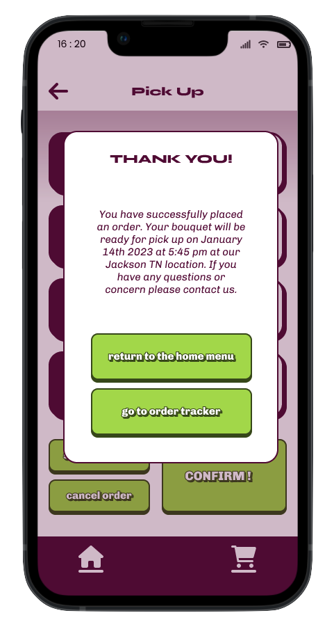
Third, I wanted to simplify the pick-up process, making it straightforward and with as few steps as possible.
- Fourth, I needed to address the issues surrounding completing custom bouquet orders.
After gathering all this data, I went back to work to refine the design.
AFFINITY DIAGRAM

ITERATIVE DESIGN IS ESSENTIAL
home screen ︎︎︎
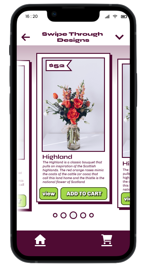
swipe function ︎︎︎
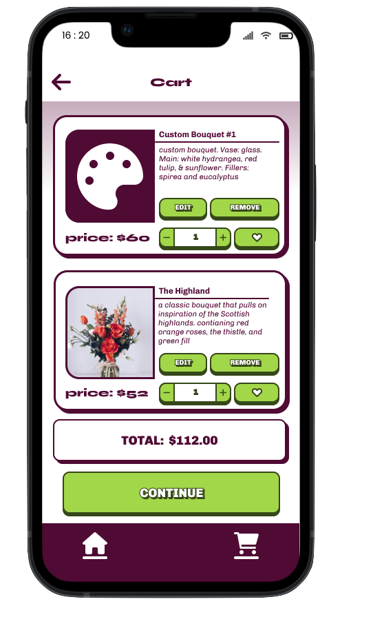
cart ︎︎︎

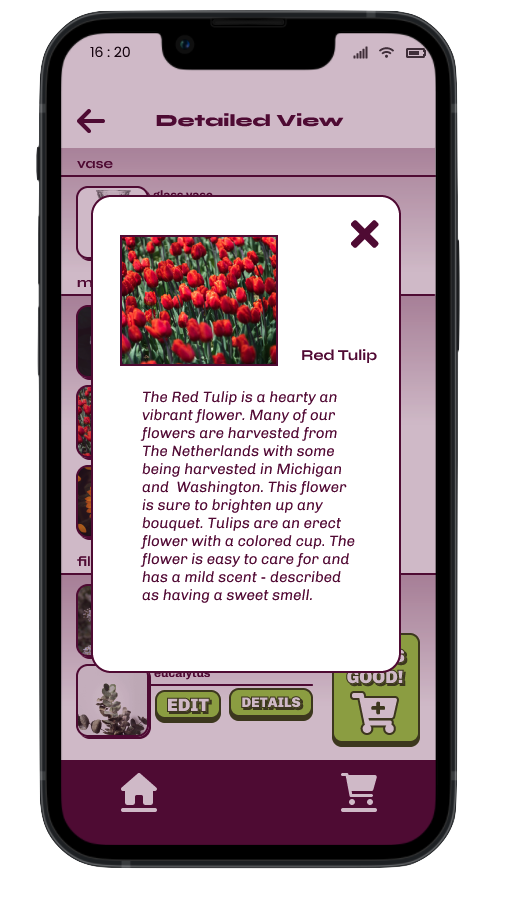
view product ︎︎︎

HIGH-FIDELITY PROTOTYPES
Below are the high-fidelity prototypes I developed for this project. I made design additions based on the feedback I received from ongoing user research. The main areas of improvement included detailed product descriptions, enhanced clarity for scheduling orders and pickup, clear call to action, and an improved product viewing experience.


CONCLUSION
To summarize, my UX design process for the mobile flower ordering app revolved around understanding the target audience and their needs. Utilizing user personas, extensive research, and iterative design methods, I developed a solution that simplifies and enhances the flower ordering experience for busy professionals. Incorporating ongoing user research feedback, I made informed design decisions resulting in a high-fidelity prototype with detailed descriptions, clear scheduling and pickup options, and an improved product viewing experience. This case study highlights the significance of user-centered design and iterative refinement, ultimately delivering a mobile app that offers convenience, personalization, and an enjoyable user experience for our busy professional users.
No good project achieves immediate success or follows a smooth path. I faced numerous challenges during this first case study. Admittedly, this project is far from perfect but from a young age, I was taught that "FAIL" is an acronym for "First Attempt In Learning." I firmly believe that the most creative and successful individuals are those who gracefully embrace failure and encounter it frequently. Throughout this course and the design process, I faced several setbacks, including the challenges of building this website. However, these failures have imparted invaluable knowledge. Exploring UX design fundamentals and principles has been both a challenging and rewarding endeavor. I hope you recognize the potential in my work and my unwavering attitude. Thank you for accompanying me on this transformative journey.
On to the next project -- time to keep learning.
-CP ︎
CHRIS PRIGG’s design PORTFOLIO
the ‘logo’ is my thumb print and ensures all the work on this site is mine.
♠︎♥︎♣︎♦︎
the ‘logo’ is my thumb print and ensures all the work on this site is mine.
♠︎♥︎♣︎♦︎